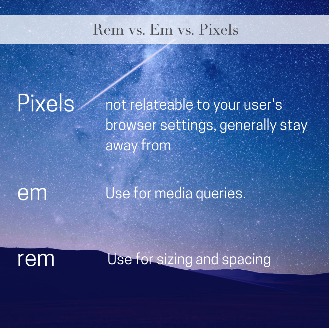
Using rem or em or pixels
Rem bases its size upon the root html element. This is advantageous for ends users because in most browsers a user can set their default browser font-size. If the user sets their default size to 24px, for example, all font-sizes should scale accordingly.
Curious why em’s are preferred to pixels? If a user changes their browser’s default font size pixels won’t be reactive to this change and this could throw off the webpages widths.
Here is a quick video showing the result when using em vs pixel based media queries to determine the size of an element:
If the user changes their browser font-size the media query should change along with it to maintain perspective. Pixels do not make this adjustment.
Check out this codepen to see the code behind it.
Read more about the reasoning behind it here This Stackoverflow answer has some nice info as well.